By: Ross Bramwell
The topic of a yield curve inversion has been at the forefront of financial news this week and we wanted to share our thoughts. As highlighted in our October e-mail to clients, we have seen significant volatility in both stocks and bonds over the course of the past several months. This has been driven by a variety of factors including the U.S./China trade war, signs of economic slowdown in some foreign countries, and even some leading signs of a potential slowdown here in the U.S. As a result, we have seen the Fed indicate an unexpected change in course recently when Fed Chairman Powell suggested that we are “near neutral interest rates.” This would be a dramatic shift from previous comments that suggested the Fed was planning on raising interest rates several times between now and the end of 2019.
Following the recent statements, the upward trend in longer-term interest rates reversed, and we have seen a significant decline in the 10-year Treasury rate. This week many news outlets are covering the fact that a few points on the yield curve have “inverted.”
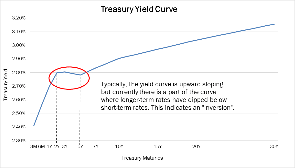
Typically, long-term rates are higher than short-term rates because the market expects future economic growth. The yield curve has inverted when shorter-term rates are actually higher than longer-term rates, meaning a slowdown is expected. A yield curve inversion is often seen as a sign of a pending recession, so it stands to reason that the media would make the most of a headline when we have our first yield curve inversion since the financial crisis.

However, we want to point out a few key things to remember about a yield curve inversion as this phenomenon will probably continue to make headlines through 2019:
• The part of the yield curve that is currently inverted is the area between the 2- and 3-year Treasuries with the 5-year Treasury, as the 5-year Treasury is now yielding slightly lower than the 2- and 3-year Treasuries (see chart above).
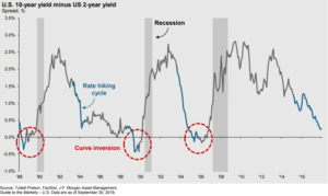
• An inverted yield curve is an often watched recession indicator, but the most common indicator on the yield curve is the 2-year Treasury yield with the 10-year Treasury yield, which is currently not inverted.
• Prior recessions have been preceded by an inversion of the 2-year and 10-year Treasury yields, but the recession has been on average 18-24 months after the inversion occurred (see the chart below).

There have been false positives as well with inversions at certain points of the yield curve so it is not a perfect indicator. We will continue to monitor the underlying economic data. While the current changes are definitely worth noting, we do not believe it should create any knee-jerk reactions in our investment allocations as we do not see the current inversion as a sign of a pending recession.
If you have any further questions please reach out to a member of your service team.
Disclosures: The following includes our opinions and forward looking thoughts and analysis as of December 4, 2018 and are not a guarantee of future investment results. This presentation includes third party sources which we believe are reliable but have not been independently verified. This is not an offer to buy or sell securities and is for informational purposes only.


